Review of TA Spring
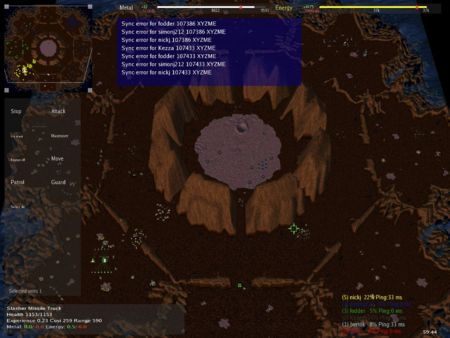
This is a review of TA Spring, an open-source game like Total Annihilation. The version reviewed is TA Spring 0.72b1.
Contents
[hide]- 1 Disclaimers
- 2 What's to like
- 2.1 It's free
- 2.2 Looks like TA, the finest RTS of all time
- 2.3 Fun to play as it behaves like TA in most regards
- 2.4 Small Download
- 2.5 Data files compatible with the original TA
- 2.6 Higher Polygon Count on units
- 2.7 Works on Linux too
- 2.8 Many maps
- 2.9 Mods
- 2.10 Complex customizable macro key bindings
- 2.11 Active community
- 2.12 Rotating the scroll wheel changes zoom level
- 2.13 Switching Perspectives
- 2.14 Eye candy - Water Rendering, Shadows
- 2.15 Deformable Terrain
- 2.16 A Macro RTS, not a micro RTS
- 3 What's not to like
- 3.1 Inconsistency of left-click and right-click
- 3.2 Can't order units to do something using the mini-map
- 3.3 Overly narrow interpretation of "Attack"
- 3.4 Group move does not work when certain buildings are selected
- 3.5 Prompt on Shift-Escape
- 3.6 Sync errors that lead to Split games
- 3.7 Key bindings for newbies that won't switch to 3D First Person Shooter mode
- 3.8 Units sometimes get stuck
- 3.9 Left-clicking on the mini-map should switch view to that location
- 3.10 Keys which worked in TA but which are missing in TA:Spring
- 3.11 The engine doesn't support changing settings while in game
- 3.12 Visual feedback to indicate successful orders
- 3.13 Minor polish things
- 3.14 Possibly add an in-game Tutorial
- 4 Conclusion
Disclaimers[edit]
These are my initial thoughts and impressions after playing several games in TA:Spring. In other words, this was written from a newbie's perspective, and so it may differ substantially from the thoughts of someone that has played TA:Spring over an extended period of time.
No offence intended[edit]
Some of the things mentioned below are already well known problems, and it is not my intention to annoy anyone in the TA:Spring community by mentioning these things, so please do not take offence at what I have written.
It's a Work-In-Progress[edit]
Importantly, please note that TA:Spring is an ongoing Work-In-Progress (as reflected by its beta status), and that there is a lot of work and effort currently being put into improving the game, including some of the areas listed in the "What's not to like" section.
Later versions may behave differently[edit]
These are personal impressions on and thoughts about the game, as it is/was at a particular point in time, and later versions may behave differently (refer to the changelog to see what's new).
For example, a number of things I disliked listed below look like they may be resolved when the new interface that uses CeGUI is introduced.
What's to like[edit]
If you have never played TA Spring before, you can get a quick overview of it here.
There are many good things about TA:Spring. Let me list and explain some of them:
It's free[edit]
The game is free, both as in beer and as in speech. TA Spring is licensed under the GPL, the game can be downloaded for free (so there is no "barrier to entry"), and the source code can also be downloaded and modified.
Looks like TA, the finest RTS of all time[edit]
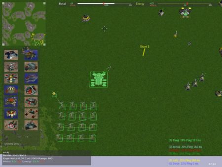
If you've ever played the original Total Annihilation, then you will immediately recognise the units, and the basic interface, as being familiar to you.
Since Total Annihilation is one of my favourite computer games, and since, in my opinion, the original TA was and still is the definitive RTS, this is definitely a good thing!
Fun to play as it behaves like TA in most regards[edit]
As well as looking like TA, TA:Spring also behaves much like TA. This includes the resources, many of the keys, and the general style of gameplay.
One big benefit of being like TA is that TA was fun to play, and TA:Spring is too.
It's not an identical game though - there are many additions to the game that the original TA never had, and I will cover some of these additions below.
Small Download[edit]
If you're tired of games that come on multiple DVDs and fill most of your hard disk, then TA:Spring will be pleasant surprise, because it's a fairly small download (especially for a game) at around 35 Mb.
Data files compatible with the original TA[edit]
From what I understand, the data files (such as maps, units) that the original TA used can also be used in TA:Spring. This means that the vast library of maps and units that modders created for the original TA can also be leveraged by TA:Spring.
Higher Polygon Count on units[edit]
The original TA had a fairly limited polygon count, which meant that units were limited in their complexity. The TA:Spring engine has substantially increased the possible count (from what I understand, it is now limited by your hardware is capable of, as opposed to being an artificial limit).
Works on Linux too[edit]
The original TA was a windows-only program. TA:Spring on the other hand also works on Linux, as well as the Windows platform.
Many maps[edit]
There is a huge library of maps, and if you try to join a game without that specific map, the game will give you a nice interface so that you can quickly download the map you need and can play in that game.
Mods[edit]
There are various (XTA, Absolute Annihilation). These largely seem to be aimed at balancing units so as to get a well-balanced game where particular units are not dominant due to being strongly advantaged. There are also other mods though (e.g. the Star Wars mod) that go further than this.
Complex customizable macro key bindings[edit]
You can bind ctrl-keys to complex actions, like "select all flying units with health greater than 30% that are not currently on the screen". How to do this is explained more in the discussion forum.
Active community[edit]
There is a very active community behind TA:Spring. You can get a sense of this from the wiki (where documentation and information about the game is kept and updated), and also from the discussion forums (where strategies, features, and development of the game are all actively discussed).
Rotating the scroll wheel changes zoom level[edit]
Possibly a standard feature in many RTS games now - but it was something that the original TA did not have (if I recall correctly), and which is useful for gameplay, so this definitely gets the thumbs up from me.
Switching Perspectives[edit]
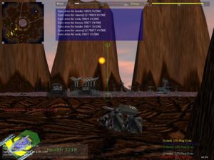
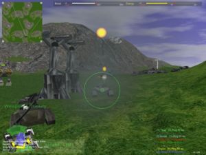
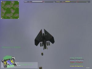
The original TA used a top-down isometric view of the world, and you could never change from that view. TA:Spring however features a full 3D-engine. The default view is the original TA view, but you can "jump into" a unit by selecting it and pressing "c". The game becomes them like a 3D First Person Shooter, where you are controlling that particular unit and its weapons. Additional to this, you can also enter a "Free-Look" mode, where you can float around the map and get into a perspective that suits you, such as to get a good view on a battle. You will see some screenshots created in this way when you are waiting for a map to load.
Eye candy - Water Rendering, Shadows[edit]
There is plenty of eye candy in the TA:Spring game. For example you can see a video of the new water renderer, which does it far more justice that I ever could by describing it.
You should also check out some of the other videos on the the download page to get a better sense of how good the game is capable of looking.
Deformable Terrain[edit]
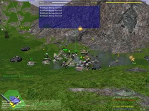
In the old TA, the map terrain was the map terrain - explosions did not change it. However, in TA:Spring, the map terrain is changed by explosions and heavy weapons fire. See this picture for an example of this.
A Macro RTS, not a micro RTS[edit]
Last but definitely not least: TA Spring is a macro level RTS game (no/limited micromanagement). This is reflected in Long queuing of orders via Shift, deep tech trees (3 levels deep), varied strategy, area / line / circular buildings of units, "repeat on" for indefinite behaviour, specifying default orders, and so forth. Basically, there is a lot of power in what the game can do, which helps eliminate the micromanagement element.
What's not to like[edit]
Short version: "Spring has too steep a learning curve".
A technical game-playing friend put it this way: "typical open-source project, the UI needs a lot of work".
My very non-techie girlfriend (who likes most RTS games) said: "Interface is critical; and the interface on this game majorly needs work". Also: "they've got all the fancy features, but have gotten the interface basics wrong". And: "it required the player to hang in there a little too long" (learning curve too steep). Also: "the screen is way too cluttered".
For both of these people, I asked them to be more specific, and vocalize exactly what they disliked, and be specific about how they would change it to solve the problem. I added my own thoughts, and tried to prioritize these. So, here is our list of things not to like in TA Spring, listed from most annoying to least annoying, with specific suggestions on how to fix them:
Inconsistency of left-click and right-click[edit]
In TA:Spring, left-click normally means "cancel", and right-click normally means "do something" (e.g. when ordering a unit to move or attack). Except when you're controlling a construction unit, and placing a building, in which case suddenly they invert it, and right-click means "cancel" and left-click means "do something". Same inversion happens when you're specifying a patrol path. This internal inconsistency gets very annoying very quickly. Please please please please: Pick one! Either left-click means cancel, or right-click means cancel. Either one is fine. But then please apply it consistently. (Seems others have mentioned this before).
Update: To the idea that users can learn to get used to this interface quirk after a 2 or 3 games, I simply say this: What users are effectively learning is to work around the UI issues. If you want to create an insanely great game, then the answer is to smooth out the UI issues, not to force your users to compensate for them.
Can't order units to do something using the mini-map[edit]
Should be able to select a unit, and right-click on the mini-map to move or attack, as per the normal map - but you can't. Consequently, you have to scroll to the location, and then right-click.
Clarification: What I am suggesting is that right clicking on the mini-map should move the currently selected unit(s) to that location (or attack the enemy unit at that location), but not change the view. Also, if you select a unit, and press the "Move" button, and then click on the mini-map (either with left or right mouse button), then the unit will not move to that location - I am suggesting that it should.
Overly narrow interpretation of "Attack"[edit]
Units seem to have a mind of their own. I had a group of several gunship aircraft and some tanks. I ordered them to attack an enemy unit. 30 seconds later I see the gunships land, having travelled half way to the battle. Why? Attack means attack that unit. If that unit disappears, it means travel to it's last known location, and then attack any enemy units in the vicinity. Attack means attack.
Update: From chat in the battle room, evidently I'm not the only person to experience this:
[4:10:10 PM] <chapparal> You know what is BS?
[4:10:18 PM] <chapparal> Your 3k metal attack helicopter bombers.
[4:10:31 PM] <chapparal> When ordered to attack, they feel the unspeakable need to land.
[4:11:01 PM] <chapparal> They will stop whatever they're going to, and attack a nearby camera
[4:11:20 PM] <chapparal> i can live with the nukes, i can't live with my units not doing the things that i tell them!
[4:12:13 PM] <chapparal> It just brings me so much frustration...
[4:12:31 PM] <chapparal> Sooooo much frustration.
Clarification: Essentially the problem is: If you order an attack on an enemy unit, and that enemy unit is destroyed, then your units that are still travelling to attack the enemy unit will immediately stop.
What I'm saying is: I do not recall experiencing this problem in other RTS games, even the original TA (although it has been a while since I last played it, so I can't be certain on this point).
In other games, I give an attack order, and even if that specific enemy unit dies, my units will still keep moving, and will still engage in the battle. They will attack the specified enemy unit first, and when that unit dies they will attack the enemy units next to it. There is no stopping en route to the battle after an attack order is given, even if the specific enemy unit I said to attack has died.
This I think is definitely the better behaviour, because it's what users usually mean by "attack", and it what other RTS games do, so it is what users are going to expect to happen - and that is why people get annoyed by the current behaviour. That is why I have listed it as something that I disliked. The current interpretation of "attack" seems excessively narrow and legalistic to me. If the answer is to "patrol", then perhaps issuing an "attack" order should (internally to the game engine) instead issue an attack order followed by a shift-patrol order, or an area attack.
Group move does not work when certain buildings are selected[edit]
If you select 30 mobile units and accidentally include certain buildings, you cannot move the group. The move order will have zero effect. The 30 units do not obey the move order. What should happen is that the building should ignore the move order - but most importantly, the mobile units should move. This seems to happen only with certain buildings (most buildings are fine). Two buildings which exhibit this buggy behaviour are:
- Arm Juno Anti-Radar / Jammer Weapon.
- Advanced Fusion Reactor Enhanced Energy Output / Storage.
- Advanced Solar Collector + Construction Aircraft Tech level 1.
Prompt on Shift-Escape[edit]
A person playing in a multiplayer game on a laptop pressed shift-escape when they wanted ctrl-1 (to specify a unit group). In other words, their hand was one key up from where they thought it was.... and pressing shift-escpape exited their multiplayer game without confirmation. In a multiplayer game, Shift-Escape should prompt before exiting.
This still happens in TA:Spring 0.72b1, but was fixed in later versions.
Sync errors that lead to Split games[edit]
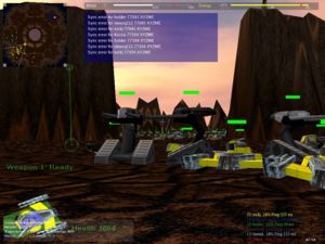
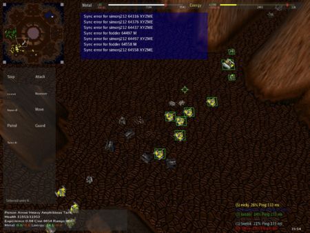
You can get Sync errors that will lead to everyone in a LAN game eventually playing different games (i.e. the one "unified" game splits into many different games, which your co-players will drop out of).
It started with errors like this on the console (this was for a LAN game with 7 players, all with lots of units, during a long-running game. Nobody was cheating, we all had the same version of the game, the exact same mods, the exact same maps, we were all playing on a local 100 megabit LAN, and were using reasonably decent computers):
Delayed sync respone from steve (170 instead of 352)
Delayed sync respone from steve (230 instead of 352)
then became this:
Sync error for bertok 88638 E
then this:
Sync error for Raven 88746 XZ
Sync error for bertok 88746 XZ
then this:
Sync error for Raven 88774 XYZ
Sync error for bertok 88774 XYZ
and this:
Sync error for Raven 88825 XYZE
Sync error for bertok 88825 XYZ
then this:
Sync error for fodder 96629 XYZME
Sync error for steve 96659 XYZME
Sync error for Tulathros 96659 XYZME
Sync error for Raven 96659 XYZME
Sync error for fodder 96659 XYZME
Sync error for steve 96689 XYZME
At which point we were playing independent games (different things built, different things happening, etc).
This happened another time in a different game as well (to different players), so it was not a one-off problem.
This still happens in TA:Spring 0.72b1 (even when the data files are identical for all players), but is thought to be fixed in versions after 0.73b1.
Key bindings for newbies that won't switch to 3D First Person Shooter mode[edit]
Look, I agree that the 3D FPS mode is pretty cool as an idea, and it's cool technology, and good as a really cool hack to show what the original TA would have looked like in 3D mode.
The technologist in me is amused by it. However, the game player in me hates it.
It's just not particularly useful for gameplay. It doesn't in any way make it a better game. A good interface is an interface that is as simple as possible, and a FPS mode that's not helpful should be disabled (at least by default - i.e. in the out-of-the-box install, there should no key bindings for changing out of the original-TA isometric god perspective - if people want to customize their install to add this, then good luck to them).
Update: I don't think the 3D FPS feature should be removed, I think that maybe the default key bindings to switch to 3D FPS mode should be removed. I'm not sure on this point though, and I recognise that there are valid counter-arguments that you don't have to use 3D FPS mode if you don't want to.
As part of the beginners keybindings, jumping out of FPS mode should not switch to "free look" mode, where you cannot select any units. It's very confusing to beginners, and not obvious to them how to get out of it. If you won't get rid of it, please make it disabled by default so that it requires the user to enable it.
Clarification: Free look mode per-se is fine, it's that Free Look mode is selected when jumping out of FPS mode that I have the problem with. If free look mode was like FPS (don't have to use it if you don't want to) then I would have not really have a problem with it. But if you get out of FPS mode, you have to use Free Look mode.
Units sometimes get stuck[edit]
Units that can't reach their destination. Examples are "Anaconda: Can't reach destination!". An Anaconda is a hovercraft (I think), so it should be able to get most places. Another example is Kbots on the "small divide" map will get stuck in the trees, and give the same "Can't reach destination!" error message. If they were able to get into that location, and the path in has not been altered, then surely they should be able to get back out again?
More info: Apparently units push other units when they walk into them. If a unit is inside a tree or inside some wreckage or inside another unit, it has been pushed in there (units being pushed seem to ingore collision spheres). The workaround to this problem is to control the unit (3D FPS mode) and navigate it out. Additional to this is that units can get stuck on steep terrain (hovercraft seem especially prone to this).
Clarification: This not about hovercraft being unable to traverse steep slopes, but rather about some same-unit hovercraft in a group being able to traverse it, and others not being able to traverse it (except by jumping into the unit with 'C', and manually navigating over the slope). However in 0.72b1 this did not seem as noticable - it may either have been updated, or the maps we played may have had fewer slopes at the borderline traversible angle.
Left-clicking on the mini-map should switch view to that location[edit]
Yes, left-click normally means cancel, but if you do it on the mini-map, you probably wanted to see that location, not cancel your current action.
Keys which worked in TA but which are missing in TA:Spring[edit]
This refers to the default keys. Some hotkey selections (e.g. "select all aircraft with more than 50% health") can be customized with the included SelectionEditor.exe, but except where indicated they cannot be customized:
- comma : Select the previous menu for a unit. (Tip: looks to have been added in 0.73b1).
- period : Select the next menu for a unit. (Tip: looks to have been added in 0.73b1).
- F5-F7 : Map bookmarks.
- Ctrl-S : Select all units in current view. (Note: Can be customized with SelectionEditor.exe)
- Ctrl-V : Select all aircraft. (Note: Can be customized with SelectionEditor.exe)
- B : Select the build menu for a unit (currently shows a ball around each unit instead). (Tip: customizing this looks to have been added in 0.73b1).
- C : Give a capture order (currently changes camera angle). (Tip: customizing this may have been added in 0.73b1).
- N : Scroll to and select next unit off-screen.
One small thing is that in the original TA, Ctrl-A would select all units. In TA:Spring, it selects all units and all buildings. It's a small difference, and it can be changed with SelectionEditor.exe, but I personally would prefer the old behaviour to be the default.
Also a few other key changes which would be very helpful:
- Perhaps the Tab key should perhaps be like typing ".info", since in the Original TA pressing Tab toggled displaying multiplayer information, with is kind of what pressing enter and typing ".info" does in TA:Spring (via a display like "nickj 6% 1" in the bottom right of the screen, which means "player name, cpu usage %, and ping" and the colour used corresponds to the player's colour).
- The Escape key should deselect/unselect any selected units or buildings. (left-clicking on open terrain does this)
- There should be a keyboard hotkey for setting "Repeat On" or "Repeat Off".' (this can be done easily by editing uikeys.text)
Also there are two methods of customizing keys - uikeys.text and SelectionEditor.exe - and it would be great if there was one unified place for customizing all keys, as opposed to one file for certain types of keys, and another tool for certain types of hotkeys.
The engine doesn't support changing settings while in game[edit]
Cannot jump out of a game to change settings (e.g. change game screen resolution, or change key bindings), and then resume the game.
Visual feedback to indicate successful orders[edit]
This relates to the confusion over the inconsistent left-click and right-click. The problem is that the user gets no visual confirmation of a successful order (e.g. attack, move, build). So, when you click to attack an enemy unit, you find yourself wondering: did you successfully issue an attack order, or did you just cancel your order? It's not immediately obvious. Age Of Empires gets around this by displaying an animation of some arrows pointing at the enemy unit that has been selected for attack. Something like this (or displaying the attack icon above the enemy unit) could be helpful to visually indicate a successful attack order.
Update: You can get this by pressing Shift, and giving an attack order. If you do this, it will show a red line leading to the unit to be attacked. It would be nice to be able to enable this red line display so that you could always see it, without having to remember to press shift; Also pressing shift, and giving an order, is not the same as giving an order without shift; With shift means "add this to your order queue" (i.e. finish what you were doing first), whereas without shift means "do this now" - these are different things, and it would be useful to see the red line indicator and get immediate execution; or a white line on a successful move order; or a greyed out building on a successful build order.
edit by P3374H - Hold shift "after" issuing the order. It shows the order, without queueing it.
- Ah, thank you! That's definitely better. Is there some way to maybe turn is on by default (e.g. type ".showorders" to toggle it on/off, so that this can be on by default all the time? That could be quite handy).
Minor polish things[edit]
- When running the game at the 1024x768 resolution, the text of many of the unit commands on the left is illegible.
- In the "battle window", clicking on the "ready" marker next to your name should do the same thing as clicking on "I'm ready" at the bottom of the screen. Currently you have to tick ready at the bottom of the screen, and then the non-clickable ready marker next to your name goes blue.
- When my commander died at the end of game, the energy and metal scrollbars went way off the screen (looked like they went to infinity). Essentially, when you have 0 storage capacity of a resource, the resource bar graphically goes haywire. It's an extremely minor bug though. To reproduce this, press Ctrl-A, Ctrl-D (to self destruct all your units). After the self-destruct, you will see the resouce bars at the top of the screen scroll far off the screen to the right.
- The "Selectionkeys Editor" should define the Commander as a builder, since it is a building unit (as well as a weapon), but currently it does not. If the commander was defined this way, you could always exclude it from a group by saying "Not commander", but currently there is no way to include it as a builder.
Possibly add an in-game Tutorial[edit]
A brief "getting started" in-game tutorial, that teaches new players some of the specific RTS features of TA:Spring, such how the repeat commands work, and creating formations, and area attack/reclaim, how to build rows / blocks of buildings, and so forth, could be helpful.
A tutorial is currently in progress, which is most welcome.
Lastly, a few other minor quibbles are listed on this page - but they are far less important than the above items.
Conclusion[edit]
From all of the "What's not to like" points above, you might think you should give TA Spring a miss. I disagree. The game is definitely worth checking out, and it could be truly fantastic, if only they would fix some of the above problems. There certainly are plenty of things to like about the game.
What's really amazing to me is that not only has the TA game been recreated using a new engine, but some really technically fancy stuff (like jumping into 3D FPS mode inside a unit) has been added. This must have taken a huge amount of effort, and is technically very impressive. But on the other hand, it makes the above User-Interface points all the more frustrating. If the really hard stuff can be done, surely the simpler UI stuff that really makes the user experience can done too?
Some of the points above are about doing less, not more; Some are about making the game internally consistent with itself; Some are about better user feedback; Some are glitches or omissions in the current game; Some are about making it easier for the user to play; ... but all are about giving a better user experience by making the user feel more in control. I honestly don't think any of the changes I've suggested would subtract from the game, but they definitely would make it far more user friendly. I.e. they would make it easier to pick up and would reduce user-error, without subtracting from gameplay.


